

I think most of the update is pretty okay (unpopular opinion: I kinda like the new battery icon), except for the notification panel, which they completely ruined.
It used to be that persistent notifications (which need to be there so apps like tasker and kde connect don’t get killed) were neatly at the bottom. Now they’re just randomly mixed in with the other notifications, so chats, emails, etc.
Laughs at you in Galaxy S10
For anyone on Samsung, I’ve also been fighting with with the OneUI changes, look into the GoodLock app from the Samsung App store, it’s published by Samsung and helps you take (more) control over how attributes behave and act, along with changing things like the Lock Screen looks and what shows up and how. I can give more info if anyone wants or provide screenshots here if anyone would like
Here’s a link to the app in their store https://apps.samsung.com/appquery/appDetail.as?appId=com.samsung.android.goodlock
Whelp, my Galaxy A16 is not supported.
I hate that my music player is now relegated to a tiny nub at the bottom of the lock screen that defaults now to google ads for sports betting unless you turn it off.
Also my phone now randomly vibrates every so often, just gently enough to think it was imagined and I think it’s to drain the battery faster to push people to buy a new phone. But that’s just conspiracy from how garbage the rest of this update has been.
Hey so I had a similar problem with the random vibrations, I found that the update turned on Notification Reminders in settings for texts and missed calls. I’d double check those settings around that and I hope it helps you
I AM STILL PISSED ABOUT THIS FORCED UPDATE. the second a linux phone is usable daily I will buy one. FUCK SAMSUNG
Sounds like you already have one. Samsung phones are pretty bad though.
There’s a lot of options. Volla phone, fn(x), fur something. You can use a google pixel 3a to put ubuntu onto. I’ve found that most of those phone have mid specs, unless you’re really wishing to dish out.
Would the Google pixel not retain some line to Google? I’ve been leaning more and more towards getting away from Google and Microsoft. With Linux, I’m scared I’ll have an unsecure system just by virtue of not knowing dick about Linux except the little coding I’ve taken courses on that barely scratched it.
Only reason I got Samsung was the cameras on the S22 or 24 or whatever it is I have. Pixel has good cameras, I’ve heard, but it’s entirely Google. Does putting Ubuntu remove all that…?
Sorry if not the place to ask.
Does putting Ubuntu remove all that…?
I mean, you entirely replace the OS, so i would assume so. For example, I know that GraphineOS is entirely independant of Google, but it’s still Android.
Oh, interesting. Thanks for the heads up!
Samsung updates, they ruin android more and more with each one. The quality of the ROM an android comes with is a very underrated thing to consider when buying. Pixels are very close to stock android. Nothing is also good, farther from stock but the changes are for the better imo. OnePlus was good last time I had one, but not sure if they still are.
Yeah I am sticking with my custom rom until the phone dies. Then probably getting a Sony phonr because those apparently have a no nonsense android on them.
Bootloader unlockable for my past 2 sonys. Plus headphone jack ftw
I have two Sonys and love them both. I like that they’re thinner so it’s easier to hold, too. Still have headphone jack and side fingerprint reader.
Good to hear. I had a sony a while ago. Xperia Z1 compact I think. Great little phone it was. Sadly they now only make really high end phones anymore.
There’s always the 5 or 10 models. Those are still great and also pretty affordable if you scoop them on Swappa or eBay
I was actually thinking of getting a 1 year old model from ebay. Might reconsider again
Yeah I’ve bought my last Samsung. These over-redesigned UIs that nobody asked for piss me off. If I wanted ugly Apple trash I’d buy ugly Apple trash.
I just got a Samsung phone and haven’t seen anything besides the current version and for me it’s fine.
People tend to overreact when something changes. It is normal.
I hate the single page scroll app drawer. I enjoy being able to swipe up to toggle between home and the app drawer. If you keep the single page scrolling drawer, you can’t swipe up to get back to home. You can change this and revert to pages like we had before, but for some unholy stupid fucking reason, you can’t sort it alphabetically. Like, really? I’ve had to manually reposition all of my apps, and for some reason the toggle seems to be pretty janky to settle an app into the place you want it, so insanely annoying. Add alphabetical sorting back, come on. Basic shit.
Don’t forget the search is now at the bottom of the app drawer instead of the top like it used to be.
sometimes it’s chill to just move a component around randomly, if a ux designer feels like “it just vibes different.” the modern equivalent of feng shui, or giving a shit about crystals
deleted by creator
I tried that but unfortunately when I sort alphabetically it just returns to the single scrolling page. When I go back to custom sort it’s still in random order. Can’t believe the oversight on this basic feature. Thanks for the advice though.
Oh boy, can’t wait to see this garbage on my Samsung Tab 9. My mom upgraded me from my dusty, way beyond eol Kindle Fire that I had, cause all I really did on it was watch YT and read/web browse, plus this model was on sale. Was excited, until I realized I couldn’t custom ROM it like my precious Pixel.
Like another comment said, Samsung/One UI is truly the Apple of Android, and it’s dogshit. So much bloat that I had to disable/delete, random UI changes that oversimplify/water down personality, stupid settings I will literally never use, etc.
The best I could get is a stock Android GSI, but I’m not sure if potential bugs and battery life issues would occur, and I don’t want to root.
Samsung caught me early (like 2010 or early 2011.) Years later I got a Pixel and was astonished at how much stupid shit isn’t in regular Android. Also looking up how to change settings on Google suddenly started being way easier.
My dad bought a new tablet. I spent over an hour debloating it with ADB just to get it to a usable state.
I really don’t know why people love their products. Even the performance out of the box is utter shit until you disable the virtual RAM.
As an oppo user I can only say: you’re wrong. You’re very wrong.
Samsung one UI is a godsend compared with this… This … shit.
Popups, tracking, insane ui choices. Half of the shit doesn’t work behind a pihole which in itself is damning enough. Everything feels bolted on. Everything feels like its only there to check boxes. Nothing feels natural. Gestures here but not there. Apple style features in Android so half of the time you’re totally lost: does this option still use standard Android logic or is this rewritten as an apple clone?
I really feel tricked into buying this phone. Excellent reviews but the user experience is very lacking. Maybe all of the reviewers are apple users and are happy to see all this shit in Android but I for one am lost. I use Android because i hate the apple way of doing things. If i wanted an apple device I would’ve bought an apple device.
I kept it because i thought it would get used to it. I did not.
Motorola is the only android for me. They can easily last 6 years plus.
I loved my 7G Play like it was my own child in middle school. It was my third phone, and not a hand-me-down like the Note 4 and the iPhone 6? that I had previously. Kids used to green bubble shame and be like “OMG wtf is a Motorola?!?!” but I loved it. I didn’t do too much crazy shit on it cause I still was a less-curious middle schooler, but I did get a cracked version of a wallpaper app to use this special Persona 5 background, and I loved it. I didn’t love my next hand-me-down iPhone X nearly as much, in fact I hated it so much in highschool that once I graduated my mom got me my current Pixel 8a as a gift.
I tested putting a custom ROM on my old Motorola to prepare for doing GrapheneOS on my Pixel (silly, since they literally have a button to do it for you on the website) and once it loaded up LineageOS it felt like Christmas again. I seriously almost considered using it again, and was just so happy to scroll through it lol.
same here with my A55 luckily i still have Oneui 6.1
I still use a note8 with OneUI 1.0 and android 9 lmao
Edit: i thought this was a samsung sublemmy, I missed Lemmy shitpost, but im not deleting what i typed i feel like i spent a good half hour bitching about it and frankly feel more vindicated seeing others complain.
full rant if you want it
I hate the battery not looking like a battery. Minor complaint tbh, I dislike it but I might come to like it.
Notifications now stop at 3. Why. Why the fuck. I moderate discord and modmail pings me 17 times an hour. I want to see that I have a text in Notifs, and now it just shows 3 discord icons when opened - I have to open the full tray. Negative user experience item
The split trays was fucking stupid. I have a fold and I STILL hate it. Fixed it in settings. Negative user experience to have forced it rather than asking. Moderate item since you can reverse it.
Adding 6 “quick items” at the top of the Tray is nice, since they fucked with the tray. It’s like…“we know we made the ui worse so here have quick access to 6 items you actually wanted as an I’m sorry present” The whole Tray is very iPhone. I did not pay for a Samsung to get an iPhone. People are welcome to like them, I’m not here to hate. But I specifically bought a Samsung phone with Samsung styled ui - if I wanted this feel id have gotten an iPhone.
Spotify now has like this…loading screen? It tells me when i have no service and won’t even open the app if I’ve lost internet (data off and walk too far from wifi) Difficult to see the upside to this “live status”. Minor poor user experience.
Google assistant has been removed from the bottom left swipe. Holy shit i hated that move. Why the fuck was it in the bottom left in the first place. Even worse, now it’s fucking Gemeni. Ai is actually ass. Turned it off and disabled it. Disabled the tile in my apps. Putting AI on my phone is a hard negative especially with the next item
Google assistant now no longer works. It just makes Google searches. I now no longer have a hands free way to tell my phone to “call (contact)”. Gemini did not recognise this command and is part of why I disabled and removed it. Now GA doesn’t either - continuing the trend of making GA more and more useless. This is such a hard negative actually has me considering turning Bixby on. Using the full phone book when I used to be able to tell my phone to call people is such a shit maneuver. Very, very poor user experience.
App drawers looks clean. Looks smooth. Reorganization is fine. Positive user experience.
They changed something about Home Screens but I dont know what. I feel like they shrank the icons? Gave me an extra row? Something. Feels off now. Somewhat poor user experience because the user is left feeling paranoid about what did or did not actually change.
voice-to-text was removed from the keyboard and then hidden and moved to the bottom left last. You know, the same spot Google assistant was also placed last update. Actual dogshit user experience hiding the VTT and making me dig through the internet to put it back. The fuck was this choice.
Overall negative and has me rethinking keeping with the Fold line given their price. If anyone has a Launcher to fix some of these issues or to restore voice text making calls, I’d appreciate it.
Yes, icons got smaller and a row was added. They also changed the weather app to be scalable (ie not every icon needs to be 1:1 squares, they can scale now).
I was able to merge everything on my second page into my first page, so now Inly have 1 “desktop”-like page with folders
My biggest issue is that now I dont see notifications when I open my phone and swipe down, I have to swipe down TWICE now. Once for the system menu, again for the notifications. Its like they switched the 2 panels’ priority
That’s really weird… Have you reverted the Notification panel back to it’s original behaviour? I have it like that and it works same as it ever was.


Thanks! As of this morning it seems like it’s working normally.
Thank you!
Re-upload, casually doxed myself

deleted by creator
I hate the battery not looking like a battery.
Welcome to One UI 7 🙃
Shitty Life Pro Tip, just keep your battery below 19% and they can’t update.
taps head 😎
I filled up my storage and now I just get download failed notifications every morning. Happy accident, but now I won’t ever empty my storage again.
third-party android modifications*
my family’s pixel devices, and mine running gos, don’t have this. nor the cell bar style, nor the ‘we have to advertise the wifi version so people feel good that bigger number = better’ wifi icon style…
the default is just a battery icon, though I have it set on my phone to also show the percent alongside it. this hasn’t changed in many years. blame your manufacturer and their skinning and modding.
Yeah seeing the post had me worried for a while but appears it’s not and android thing but a Samsung thing. This is why I stopped buying Samsung phones 6 years ago.
Oh thank God. I’m probably going to update my Pixel soon and was worried
One UI 7 is the worst update I’ve ever suffered in my entire life.
Win7->10 wasn’t this bad.
I was given an old Galaxy tab 8 on friday. I played with it for a while, and it was super snappy and quick.
Then it updated
then updated again
then updated again.
And finally again.
Ended up with OneUI6.1
Tablets like 1/3rd as snappy as it used to be.
If thats how big of a shit pile UI6 is, then I pray to god UI7 never gets on my tablet.
I see you’re skipping windows 7→8 which is fair because most people did
There is no Windows 8 in Ba Sing Sei.
It convinced me to finally order a refurbished Pixel 8 sp I can switch to Graphene.
OneUI 7 is visually a steaming pile of shit. Real “we have iPhone at home” vibes throughout. Specifically for me what they’ve done with icons, why cant i have white or colored icons with dark mode?
Beta testers complained so much up to release how uncohesive everything is and Samsung constantly shut down feedback with “this doesn’t meet our design goals”. Surprise, now it hits general public and everyone still hates their goals. This won’t ruin them, but it defintely makes me reconsider Samsung going forward.
Edit - yes I know there’s third party solutions to most android problems, but shouldn’t have to load apps and spend hours customizing to interface without vomiting.
All of my family members have Samsung phones and every single one of them has been complaining about the update. Normal people, tech people, it doesn’t matter. They all hate it. It’s actually kind of insane. The only reason I have been spared so far is that my phone is too old to get the new OneUI update. I can’t imagine any of them will buy a Samsung next time they buy a phone if the UI stays like this. People who buy Android phones are people who like Android phones. You’re not going to lure iPhone users to Android by being more like an iPhone because they’re just going to buy the real deal instead. It’s just stupid. Just the battery icon discussed in the OP was the source of a lot of complaints because it is extremely hard to read especially for older people.
I hate how ultra round everything is. Especially sliders like for volume feel so weird and look that way too. I really liked the OneUI 6.x rectangular design with rounded corners way more.
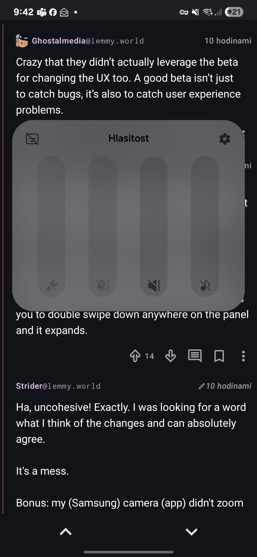
The dropdown panel is also stupid. It’s just so incredibly clumsy as you have to pull it down from very top, meanwhile the other mode allows you to double swipe down anywhere on the panel and it expands.
I am not sure if it is intended to look like this, but how the fuck am I supposed to read my volumes now? What the fuck is this contrast? I have to wear glasses, but without them I could manage (like, when I wake up), but this is now almost unreadable without them. Same with battery.
The volume looks good for me

Crazy that they didn’t actually leverage the beta for changing the UX too. A good beta isn’t just to catch bugs, it’s also to catch user experience problems.
To your edit: that’s one of top 3 reasons I moved to iOS and while there are annoyances, overall I’ve been happy with it for 3 years. Not suggesting everyone should switch but if you’re tired of tinkering, it’s a good option.
Ha, uncohesive! Exactly. I was looking for a word what I think of the changes and can absolutely agree.
It’s a mess.
Bonus: my (Samsung) camera (app) didn’t zoom when I pressed 3x and after I pinchzoomed manually, I could not take a photo (button did nothing). That never happened before and I missed a good shot 🤬. Afterwards it worked again. Hope that’s not recurring…


